Sunday 20 December 2015
Monday 14 December 2015
Sunday 13 December 2015

Poster Research


Here are some of my favourite posters, I particularly like both the use of red and black and think that they complement each other well. I also found that looking at different posters for the same film was particularly interesting and seeing the differences between them. All of these posters have a key central image and that is certainly something that I need to be looking at when producing my own.
AF
Poster Research


Here are some of my favourite film posters, all of which are very different in the way they present the style and tone of the piece. Generally the colours are bleak and dull, often with the text being on white or black, and the background being some form of black or white. I like the subtle use of colour, such as the vibrant yellow in the 'Nightcrawler' poster, and the red 7 in the '7 minutes' poster. These will all be influences in my own film poster product.
EL
Saturday 12 December 2015
Poster Research


When researching into different styles of film posters, i found greatly varying styles. I particularly liked the posters that had a greater element of simplicity to them, such as one central visual element. I felt that these styles of posters, such as many above, had a real sense of professionalism about them. I would like to be able to convey this in my own poster.
Wednesday 9 December 2015

Tuesday 8 December 2015
Reviews Plan
We plan to include graphics throughout our trailer however we wont be including any graphic saying the director or actors or any of there previous work as every one is unknown and this time would be better spend showcasing the reviews.
Therefore our current plan is to have:
Therefore our current plan is to have:
- 3 narrative graphics which are all shown in the first and second acts of the trailer
- 3 reviews which are all shown on in the final act
- Title
- End credits
- Release date
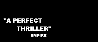
- "A perfect thriller" Empire - It's important that the audience is aware that the film is a good thriller, as there are many bad ones that come out throughout the year. Empire being a very reputable source will encourage audiences to follow it's opinion. Empire is a very mainstream magazine, however it does also include reviews of slightly lower budget films, which includes our film.
- "The smartest film of the year" IndieLondon - We also need to include a review from one indie magazine, in order to attract a wide range of different demographics. By stating that our film is smart/intelligent it may attract people who had previously never thought about seeing it.
- "Exhilarating" Times - One review should come from a well respected British newspaper and should contain a single word, this speeds up the pace of the graphics and makes the film sound exciting and something worth seeing
Currently these are the reviews which we will use however after we have created our own magazine we may wish to change the name of them. This will be very easy to do at a later date.
The plan for the graphics is to use the same font that will be used for the title in order to keep our trailer consistent. We would most likely use a black background and white text, the text will most likely also contain the smoke effect which we may also use on the title. The size of the text is also very important and the review will be larger than the magazine name as that is the least important section. The review would be in a different section of the screen each time and slowly enlarge for the three seconds its on the screen, this will be in time to the music.
A mock up for how it may look is seen below, this isn't the font that will be used however this shows a typical placement and arrangement along with how it potentially could look

AF
Narrative Graphics Plan
After doing research into narrative graphics, I found a key element was for the lines of text to be presented boldly and kept short. A working narrative we have is "Three men; Two choices; One decision". We liked the idea of a countdown to build the tension and the simplicity of the sentences.


I began with a modern sans serif font in black against a white background. Although simple, if shown correctly, black against white can create a powerful bold effect, especially if shown in a predominately dark colour palette trailer. I then experimented with a much bolder font which evoked a more classical action film feeling. I prefer the more modern font as I believe it leaves the audience with less presumptions about what the film will be about and allows them to decipher it themselves. Furthermore, our action thriller is set in the present day and I believe that a lighter looking font will reflect this.


I also wanted to experiment with what the effect would be with a different colour. I choose a dull blood red to signify the possible death and dark nature of the film. This colour will also connect with our title, being shown against flowing ink, which itself could be seen to resonate blood. I did like this look however I felt it lacked the impact factor we are looking for.
To contrast, I later experimented with white against a black backdrop. I liked this overall look the most due to its punchy and eye-catching nature. The white also lifts off the black making sure that the audience sees the text even though it will only be visible for a limited number of seconds. However, if our trailer ends up have a predominately dark colour palette, this may cause the narrative graphics, if they were in this style, to blend in with the visual images. We would not want this as the narrative graphics break up a trailer and feed the audience vital information about the core plot of the story.
We know that we want to keep the graphics clean and with bold colours. However, when we approach our final narrative graphics, we need to first consider the overall colour palette of our recorded footage that will allow us to make a judgement upon the backdrop.
EJ
Font Plan

For the font itself, we generally looked at thin sans serif fonts, some found online, and others taken directly from movies, such as the Skyfall font. We liked the straight edged bold effect the fonts have, but liked the boldness of the serif font, Rockwell extra bold. This font is not our favourite, but we particularly liked Avenir Next and PT Sans Caption. After debate, we decided that the PT Sans Caption was too curved, and didn't fit with the edgy urban feel of our product, hence we chose Avenir Next.
We next had a look at styles and effect we could make to the font for titles, and narrative graphics:


The Skyfall title, despite the font being unknown, is simple sans serif in bold. The effect over the top is some sort of dusty, snowy or smoky brush, contrasting the precise bold outline of the black text. We like this style as it fits the action thriller style of our film trailer. I recreated the style, using a similar font to that used in the 7 Minutes trailer and poster, and overlaying it with a similar brush effect. It created the same effect, and I used the font Avenir Next heavy. I created both black and white text, both overlaid with the grunge effect, much like how the Skyfall titles are both black and white. We will generally use this font for all titles, and all narrative graphics, but the grunge effect over the top will only be the font for the main film title.


Relentless is one possible title for our media product, so I used this to create several mock fonts that we could use. We had inspiration from the film 7 Minutes, where the title had some form of line through it. We liked this idea for a font, as you can see above, I thus tried to create a similar effect using the Avenir Next font. As well as this, I made two other mock ups, including another grunge effect, much like the font in Skyfall, and another basic change to the Avenir Next font.


One of our other possible titles is Stalemate, and so I created several more adaptations of the Avenir Next font, for examples that we might use as our own font throughout the entire trailer. We liked the Line running through the title 'Stalemate', as it represented the two sides in the film, the side who wants to kill the hostage, and the side who does not. The sides are unequal, being 2 against 1, which is also represented by the font being split into thirds.
For our font, we are keen on using the font Avenir Next, with some form of our own customisation, as we will need to decide between the grunge effect, or the line running through the text. These effects may not be consistent between all text in our trailer, but we will definitely use the Avenir Next font for all text.
EL
Ident: EAE productions rough plan
Ident: EAE productions rough plan
We were clear about the sort of style we wanted for one of our idents, and so I had a go at creating a small 2d version of what we want using motion. I started by creating the logo in Adobe Illustrator, sloping the two E's against the side of the A. I then put this into motion to create the effect shown. A further idea is to use a texture and different colour over the letters, much like that seen below.

In an ideal world, this ident would be in 3d, meaning when the E's spin, you seen the side angle of the E. I will be looking to achieve this by using an application called Cinema 4d, which allows one to render clean text in 3d.
EL
Ident 2 Rough Cut
This is an adaptation from my Ident practice 7. When playing with the look of the Ident, I tried to think of a good production company name. I came up with 'Full Circle Productions', as with every revolution of the kaleidoscope it created a 'full circle', hence the invention of the name. From our Ident research I knew the importance of choosing the right font. The use of block capitals increases the attention to the name of the production company; I also spaced out the characters to the limit of the widest circle created and chose an imperfect font that is not fully white to reflect the imperfect changing nature of the kaleidoscope. I tried to add a slow effect to space out the pulses so that only one or two occur in the frame of the Ident, however this consequently made the frames jumpy. I will have to investigate this further if I want to slow the intervals.
The Ident needs refining however I would like to use this for our final cut as i believe it has a professional feel to it.
EJ
Water Ident Practice
Practice 1
For the first practice, I poured the purple water on the surface, and filmed at the height of the counter. I wanted to achieve the look of the water approaching the camera, this was best when the stream of water couldn't be seen. I then rewinded the video and found this had a more interesting effect. Although I was pleased with the effect, I felt it failed to look fully professional.
Practice 2
In the second practice, I left the water to expand across the counter and after adding an effect over the top, was able to create a mirror effect. I really like the mirror look however if we were to use this for our ident I would have to do further research or consider greater ideas on what could be reflected in the water.
Practice 3
In an attempt to try to contain the spreading water I used a plate, and poured onto it. I felt that the overall effect needed something more to improve the Ident.
Practice 4
Whilst playing with Final Cut Pro, I found a kaleidoscope effect. I added this on top of the video from practice 3. I really liked the patterns that were made, however it was rather inanimate.
Practice 5
I used the kaleidoscope effect again but over a video of me swirling ink on a plate. In this video the white flashes are my hands moving over the plate. Although this had an interesting effect, i felt that the unavoidable flashes need to be at more regular intervals. However when trying to apply this to the video by repeating my hand movements at regular intervals, it also repeated the intricate designs which made the effect less impressive.
Practice 6
Surprisingly I used water and milk to create this effect. I used milk as I wanted a liquid that had a different consistency to water and would allow it separate. The effect was good, but as with the other practices, wasn't as visually impressive as professional company Ident's.
Practice 7
This was my favourite practice. I created it by swirling a plate and then adding the kaleidoscope effect. I would like to adapt this further, and see where I could take this
EJ
Monday 7 December 2015
Title Name - Ideas

We have produced this graphic using Wordle showcasing all the potential titles for our film. Many of them revolve around similar ideas, such as incorporating Dark or Three in to the title or centring the title around the key plot point of the film, the decision what to do with the girl. Ideally we also wanted a title which was only one word, disregarding The. This is because we thought that it would instantly tell the audience that this is a thriller film
Currently our favourite titles are:
- Stalemate - This informs the audience that the film centres around a conflict that can't be solved. We also like how it's one word as it stands out far more
- Relentless - This title sounds exactly like a thriller film, which is essential however it doesn't quite fit with the narrative of our film which may be confusing for audiences
- The Prisoner - This title immediately tells the audience about the one of the central conflicts in the film; the girl. The title is also short and to the point which is important in a thriller title.
- Deception - This title sounds exactly like a thriller film, which is essential however it doesn't fit with the narrative of our film at all which may be confusing for audiences
AF
Sound Plan
For our sound, we particularly liked the Disappearance of Alice Creed trailer, as well as Welcome to the Punch trailer, as they both effectively used layers of foley sound over the soundtrack. For our soundtrack, we want a low key rhythmic beat which slowly builds throughout the trailer. This should be layered with some form of synth sound that repeats a melody when the most suspenseful scenes are on screen. This will all be layered by foley sounds, some of which we will record ourselves, such as the water drop sound, and others we can find online for free. Our music producer will be Joe Reeves, who creates his own music and posts it on soundcloud. His link is below, and he creates various styles of music, including more alternative rock, but also more suspenseful piano pieces, such as his most recent work titled Spilt. Over all, we will ask him to create a suspenseful piece, with a heavy background beat to fit out trailer. We will send him early edits of the film so that he gets a feel for the timings, and thus he can fit the music to the trailer, with beat drops, pauses and moments of silence worked into the soundtrack at times of dialogue within the trailer.
https://soundcloud.com/joe_reeves/tracks
EL
Sunday 6 December 2015
Title Background Graphics Influences
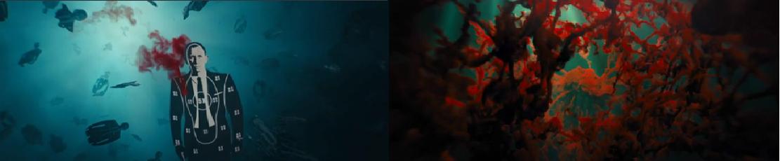
One of our ideas for one of our ident, the ink going into water looked so good that we have decided to use it for the background of our titles. If the ink is a deep red then it looks like blood. The plan is to shoot this on a clean white background with no reflections.
Several films has influenced us in this idea, in particular the horror genre where several trailers contain a final shot of blood dripping down.
'It Follows' a modern horror film final shot of the trailer is exactly this. In this a shot blood is flowing into water, with the title then appearing in the middle of the blood.

As you can see this effect is very similar to the look we are going for and have already achieved. Our ink probably wouldn't be as thick or cover up as much of the screen however. Our's though will certainly arrive from the top and fall into frame, similar to this example.
Another horror film which utiltises blood in it's title is Oculus. In this the blood is shown to be forming in several shots before the camera then is pulled out to show it dripping of the side of a wall with the text in the middle of it.

The white title stands out over the blood which is dripping down, our plan is to utilise water so that the blood is less thick however this shows how effective using this effect can be as the deep red catches your attention, along with the dripping blood which is very striking.
As much of Skyfalls opening credits are under water, there are several shots of blood in water.
The blood particularly in the second image is very influential to us, particularly as it looks similar to our attempt, the close up of the blood/ink twisting in the the water. This just shows how powerful the effect can be given that it was used throughout the opening credits to one of the biggest films ever made. Skyfall is also a thriller like our film, showing that this effect also fits into our genre.
Using Art of the Title I have also found another credit which uses a deep red and flowing water/blood. Hannibal's opening credits are very powerful and have been critically acclaimed. Our titles wouldn't be making any shape however and again this is for a TV show however several aspects can be used.

The white background works extremely well when combined with the red, this is useful as it's similar to our plan. The contrast in the colours makes the red pop out of the screen and therefore drawing your attention towards it.
AF
Saturday 5 December 2015
Ink in Water Ident/Title Practice
Above you can see our practise for filming ink going into water. Originally the plan was for this to used as an ident, however because of how effective we feel it is, we think it perhaps could be better served as the background for the film title. Using a deep red could perhaps give the impression of blood which would fit in with our film plot. After playing around with the speed of the footage we also found that having it is slow motion is perhaps the superior option as then you can clearly see the ink slowly twist and contort.
Several problems arose during this practise that would need to be fixed for the actual product, most importantly the reflections. These are extremely annoying and were an oversight on our part when filming this. Another area which needs to be changed is the outline of the bottle, if this effect is going to be successful for a film title then it needs to be a clean white with nothing except for the ink coming down.
AF
EL
Subscribe to:
Posts (Atom)