We decided to keep our script very simple, with a relatively minimal script in comparison to other trailers. Many of the lines will be sound bridged, thus carrying them through to further shots
One of our idents is going to contain partly something that we have filmed. Our idea that we particularly like is using marbles, this is due to the sound that they make when rolling and their perfectly spherical shape which makes them visually appealing, especially when you can see the inside of the marbles.
We thought that this test went extremely well, however we couldn't quite get our original idea, of a single marble rolling directly into the camera. This didn't work due to the surface that I was filming the marble on was slightly crooked to the side rather than directly towards the camera, this meant that I couldn't get a good enough shot of the marble. This meant I had to experiment and work with what I had. From my testing I found that the one that we all agree as being the best is the marble spinning, either slowed down or in real time. If we can get the marble spinning flat and not move around the screen then I think it could work very well as an ident.
We came up with several ideas for our ident which is filmed these include using marbles, ink or water.
Ink Ident We thought the idea of the ink in water would look amazing especially in slow motion, we found several videos online showcasing how good it can look. Our plan is for the ink to come down from the top and then the name of the company appears
An ident that has influenced us is from Watch. In this ident the colourful fluid nature of the ink will look wonderful when filmed. This ident is 22 seconds however whereas ours can only be around 5, however this looks something we certainly want to achieve. We most likely however wouldn't be able to ink more than two colours at a time.
The ident which is shown below is similar to how we would want ours to look.
Marble Ident We thought that the marble ident would work effectively due to the perfectly spherical marbles which when filmed would look beautiful. The sound of marbles rolling also could be incorporated into the ident which give the ident a recognisable sound.
I couldn't find any idents involving marbles however many different idents involve circles showing how effective they can be.
BBC One's many different idents all involve a circle in one way or another
Many different production company idents also involve spinning circles which is another idea that we are investigating with doing with marbles, these look extremely professional.
Water Ident This ident would involve the use of water falling and splashing onto a surface, either in slow motion or in real time. We think this could work due to the almost unrealistic look that water can sometimes have. This ident may also involve reflection which works very effectively when filmed at the right angle in the right lighting. This ident could also involve the water falling onto a plate, this also links in the previous idea where I have talked about how professional a circle looks in an ident.
We are going to test out all these ideas and then work out which ones work the best as an ident and then explore that ident further.
For our second ident was wanted to produce something that we had filmed. Very few idents are actually filmed so we think this should set us apart and grab the audiences attention.
BBC 2 have used several filmed idents over the years, some examples are below.
These idents contain a sans-serif 2 on a clean colour blocky colour. They are all extremely simple and instantly recognisable, which is one of the key aims of a successful ident. However our production company wouldn't be that well known and therefore it would be essential that we clearly show the name of the company. The bold colours are very striking and draw your attention towards the ident and makes it far more noticeable, this however is a tv ident and as ours is for use in a film trailer it needs to get to the point faster.
Film 4 have also produced a vast number of idents which are filmed.
The clear logo works very well, due to the white blocky font which stands out on the moving background. The slow motion works very well in this ident however again this is a ident for tv and therefore may not transfer into an ident which would work in a film trailer. The use of water is something which has influenced us in several of our ideas, due to the magical-esque qualities it possess.
Other idents which have influenced us include Pixar and Dreamworks, both of these are computer generated however they both contain realistic movement, however they are both film company idents and are both very iconic.
These two idents are both farily simple but very effective, which is something we definitely want to emulate. The serif font works extremely well, this tell us that we should probably attempt something similar. The water effect is the Dreamworks ident is also powerful along with the use of reflection, as stated before the use of water is something we are going to attempt.
In our trailer we will need to have a large number of Foley sound, some we will be create ourselves and other we will have to download.
We will need:
Water Drip - This can easily be reproduced from a running tap or I have already found a very effective sound clip which I used during the anamatic
Panting - This will have to be produced by us, again very easily and where ever we want. We will need a large amount for different shots so it is important that we record a variety
Impact Sound - This sound will have to be produced on set while filming in order to get a realistic sound
Deep Breathing - By us again can be produced any where
Rustling sounds - Will have to be made by us on set
Door Bell - This will be extremely easy to make on set
Door Slam - This will be made by us on set
Zipper - Will be produced by us on set however it would be possible to download one of the internet
Car Door Slamming - Can be made by us at any point
Heavy Breathing - Made by us at any point
Shovel digging - Could be made by us on set or it is possible to download one as the one used in the anamatic was very successful
Crying - Will have to be produced on set
Gun shot - We will have to download this sound clip as it wouldn't be possible for us to produce it
As you can see we have a lot of foley sounds to produce, it shouldn't be too difficult though as using the directional mike you can get a very clear sound which we can then layer over the music and dialogue
Above you can see some example of the foley sounds which we would use and how we would layer them into our product. All of these were found online for free for the purpose of our anamatic, however the online one that we won't try and produce ourselves is the gun shot.
The sound doesn't start until 11 seconds into the trailer, when the ident comes in and non diegetic crackling sounds sound bridge into the pulsating beat, which is quickly layered with foley screaming. This stops with a small boom effect, at 17 seconds where there is a small montage, showing diegetic foley sound of drills, staple guns and ropes barricading the room. The soundtrack really kicks in around 25 seconds, which consists of a snare drum beat, and this is layered with foley sound of doors opening, cars driving and diegetic speech. At 44 seconds the music stops on another 'boom', and the beat builds again, in a faster tempo and different style. At 1.10, the final act starts, and the soundtrack develops into an instrumental piece, picking up pace as the montage plays out. Overlaid are foley sounds of vans driving and guns shooting, until the title comes up and a final gunshot cuts off the soundtrack. The beat and style in which the narrative graphics are shown is something we will consider using in our own trailer.
Welcome to the punch starts with a sound bridge of atmospheric sound, as well as non-diegetic police sirens. The layers of foley sound build the intensity while a high pitched synth comes to a crescendo around 15 seconds in. The sound stops, as only dialogue is hear, making what is being said more dramatic. There is a foley non-diegetic sound of a helicopter played over the ident, which fades out as the snare drum and synth is played again, at around 27 seconds into the trailer. The soundtrack builds, with added drums and rhythmic beats until 1 minute into the trailer, were there is a pause in the music and only someone singing, which drops at 1 minute 15 to build again for the final act, the montage. The foley sound layers, with car crashes, shootings, explosions and speech which builds the suspense, until it comes to a halt as the title comes up.
Like in many thrillers, the trailer opens with a boom at 2 seconds in. This is followed by asynchronous sounds of police car sirens against as the opening image of the city of Soho is shown. The sound boom is used throughout most thriller trailers and is also used in Welcome To The Punch, hence we will use this in our trailer. 10 seconds in, there are sounds of an alarm going off keeps the audience interested as it builds the tension. This effect is often used early on in the trailers, to grab the audiences attention early and keep them watching. In our own trailer we want some foley non diegetic sound effects to have this effect on the audience. 15 seconds in the soundtrack begins. The ticking clock creates suspense, which is the desired effect for our product, as well as emphasising running out of time. 21 seconds in the trailer it continuously uses the sci-fi type boom to hold the tension at moments of importance. 44 seconds in, the orchestral style soundtrack begins, with the rhythmic beat coming from the strings themselves. 1 minute and 5 seconds in, sound booms and orchestral noises are used. We would like to use these traditional thriller foley sounds so that our trailer fits into the genre. The soundtrack is overlaid with foley sounds to build the tension, keep the audience interested and reveal small elements about the plot. The sound used in this trailer adheres to the thriller genre, and will influence us in our media product.
Disappearance of Alice Creed Order of credits as they appear on screen and why:
0.11secs - 'CinemaNX' appears on the screen. This is the production studio for the film, generally the production/distributors ident or name appear before anything else. This is a general convention for all trailers
0.16sec - 'Everything was prepared' - the first narrative graphics appear. This is setting up the trailer for the viewer. The font is blue is slightly distressed behind the text. Unlike many other trailer the text isn't in centre of the frame and is instead just below the centre.
0.26secs - 'Everything was planned' - next narrative graphic. Similar effect to the last one in that it is setting up the film/trailer. Notice the repetition of Everything was p..., very effective in attracting the viewer. Building excitement among the audience watching as it adds a sense of pace to the trailer. Same font as before
0.35secs - 'Everything was predicted' - Same effect and font as before
0.39secs - 'Except this' - First time it has deviated from the formula, however still repetition of the E. I think this is successful as by changing it up, it tells the audience that the trailer is moving into the next act
1.09secs -"Twist after Twist..." - Review shown, encourages the audience to go see it due to them believing it to be a better film
1.15secs - "A perfectly formed thriller..." - A review shown yet again, reinforces to the audience that it's a good film. The reviews are also phrases which someone thinking of seeing a thriller film wants to hear, therefore carefully chosen quotes are important
1.20secs - "A proper nail-bitter" Empire - Another review, first one to also say the reviewer, due to Empire being a very well respected film magazine, meaning people are far more likely to view it based of it, however it makes me feel far more uneasy around the other two quotes as it's not said where they are from, making me question of legitimacy of them. Again a phrase that people want to hear
1.25secs - "Ingenious" The Times "Scorching" Daily Mail '4 stars' Total Film - Another three reviews shown. Each saying the source, all reliable as seen above this makes me uneasy around the first two reviews. The use of stars instead of a quote for Total Film, is visually interesting as it is the first non-text used
1.31secs - 'The Disappearance of Alice Creed' - Title of the film shown
1.34secs - End credits - stating everyone involved in the film, a necessity to have
1.40secs - Release date and website - Shown at the very end, in order to keep the viewer watching. The website is in a far smaller font, showing how it is far less important than the release date
No actors or directors names are shown at all. This is very unusual for a trailer and is due to the actors/director not being well known at all and therefore holding no star-power meaning nobody would see the film due to them being in it. The studio has therefore taken the decision to put in more reviews in to the trailer in the place of where those names would go, this was in an attempt to draw more viewers in. This trailer has a lot of credits in it, mostly due to the 4 for the reviews. I feel the credits aren't that successful in many places as I feel that there are too many with many only having around 5 seconds between them. However I do really like the alliteration in the narrative graphics as I feel that it very successful in drawing in viewers. We however didn't overall like either the font or the colouring, I feel as if the blue is unsuccessful and a white would be more effective. The font is also not very interesting and quite standard, in our trailer we would be looking for a font which is slightly thicker.
Welcome to the Punch:
0.19secs - 'Momentum Pictures' - production company introduced, again shown first however this time it is slightly further into the trailer
0.37secs - 'In 2013' - non-specific release date shown very early. This creates excitement and adds pace to the trailer due to it's short, snappy nature. Thee text is in the centre of the frame and has a transparent effect meaning that you see blue light and some movement through the text
0.41secs - 'Know' - Again adds pace and creates excitement due to its quick, simple nature
0.45secs - 'Your' - Same as above
0.51secs - 'Enemy' - Same as above
1.08secs - 'From Executive Producer Ridley Scott' - Ridley Scott larger than other text highlighting his importance as he has the star-power to entice people to see the film.
1.42secs - 'Welcome' - Instantly see that the title is going to be introduced in the same way as before
1.43secs - 'To'
1.43secs - 'The'
1.44secs - 'Punch' - Title shown extremely fast, 4 words in 2 seconds. Effective and fits in with the style of the rest of the trailer, short and snappy and increases the pace of the trailer
1.44secs - 'Welcome to the Punch' - Full title shown
1.48secs - Credits and release date 'Coming Soon' - Credits revealed at the end, as per the conventions. Small moment of action between the title and the credits which is fairly common for thriller trailers. Coming soon in a larger font to notify the audience
Again no director or actors names are shown throughout the trailer, I feel this is a strange decision due to the main actors James McAvoy and Mark Strong both being well known and respected actors. Eran Creevy is less well known, so that is understandable. The studio has instead taken the decision to only show Ridley Scott's name, who is obviously a very well known director, this is in an attempt to attach his name to the film. No reviews are shown which is again an odd decision, the trailer instead decides to show more of the introduction to the film and the characters. I particularly liked the faced paced nature of the graphics, which greatly helped speed up the pace of the trailer
7 minutes:
0.20secs - 'Starz Digital' - production company name, shown very late in the trailer and only appears for a less than a second, as it fades in then fades out almost instantly
0.53secs - 'Out of Luck' - first narrative graphic, thick long white text all in capitals, stands out on black background, sparks going on behind.The text is in the centre of the frame
1.02secs - 'Out of Options' - same as above
1.08secs - 'Out of TIme' - same font style as above. Repetition of 'Out of' is striking and makes the text far more memerable
1.27secs - '"A distinctly modern heist flick..."' - the first review appears, three quarters of the way into the trailer
1.32secs - '"Crackling with energy" The Moveable Fest' - Important to state where the review came from, gives a far better impression. The place where the review came front is in the same font just far smaller and grey rather than white
1.36secs - '"The tension never lets up" The hollywood reporter' - As this is a far more reputable source the text font is now the same colour as the review, white rather than the grey like the last review. This is certainly due to this source being far more well known
1.53secs - '7 minutes' - Title of the film comes up
1.59secs - Credits - moment of action between the title and the credit. No where near as many credits on the trailer compared to the other's I've looked at
1.59secs- Release Date and social media - This time the text is yellow, big noticeable change, definitely grabs your attention. Font is still the same. Social media hashtag at the bottom so viewers can interact and find our more about the film. Stays up for 4 seconds, quite a long time
Again in this trailer there was no actors or directors names shown; this is appearing as a common theme across this genre of films, perhaps it is due to the extra graphics slowing down the pace of the trailer? We all really like the graphics in this trailer. Especially the text font, the amount of narrative graphics and reviews. The trailer also reiterates what the other trailers have shown us which is that it's essential to state where the review came from and to have some form of repetition in the narrative graphics.
The Town:
0.07secs - Warner Bros - as seen in every trailer, the production company logo is shown, WB as the biggest compnay is shown right at the start
0.30secs - Legendary Pictures - Next production company
0.31secs - GK films - Final production company shown, final two shown for around half a second each
0.37secs - 'This fall' - Release date comes far earlier compared to the other trailers I've looked at. Big bold lettering, all capitals. A metallic colour on a black background
1.05secs - 'From the acclaimed director of Gone Baby Gone' - reminding the audience of who the director is. The film is in the same font as before however the other part is smaller and slimmer
1.14secs - 'And the studio that brought you The Departed - reminding the audience that this studio aslso produced a very successful film, gives the impression that this film would be of the same standard. Same font layout as the previous credit
2.25secs - 'The Town' - Same font as for the previous credits however this time the Town is is very large and covers up a large portion of the screen
Like all the trailers I have looked at no actors or directors names are shown, this one however contains one credit referencing another film which he directed. The font in this trailer is similar to how we want want it, bold but fairly slim. The metallic effect also worked and therefore that may be something that we want to look into. This trailer also contained no narrative graphics or reviews, which we are going to have. This film is high budget containing A-list actor, meaning it doesn't have to mention the reviews however ours will.
I have finally completed the anamatic, we are all extremely happy with the result as it gives us a great idea of how our trailer will turn out. This is also very helpful as it shows that our trailer is already around 2.11 mins. This is great as it means that if we film everything that we plan to then we have the ability to scrap the worst parts. Using the anamatic you can already see several shots that probably won't work, however we'll still film all of it and see how they turn out.
To practice for the filming of the trailer as a team we shot two scenes to test our ability of being able to capture good quality sound in varying surroundings. The first scene was shot in the atrium of the EAB, we used a directional to pick up the conversation between the two characters. The second scene was outside the EAB, as this was outside we used a stereo mic to limit the surrounding noise that might cause interference. Throughout the filming we found it very challenging to get the boom pole and mic close enough to capture sound yet to not enter the frame. There was one occasion in the first scene that the mic does come into frame. This is something we will now be aware of to avoid when filming as it is easy to not realise.
The first scene was inside an atrium, this was very challenging as there was high levels of surround sound and a slight echo created by others in the room. We primarily did a two shot for this scene showing a conversation between two characters.
In the second scene, we filmed outside. on one hand, we found this easier as their was no vocal background noise, however our challenge instead was the wind. This is picked up slightly, and therefore in future it would be good to film in an area protected from the wind to prevent interference.
I had a go at playing with ident ideas for the logo in illustrator. I using fonts, shapes and names to come up with some basic visuals for what we might use. We particularly like EAE productions, formed from the first initial of each of our names. The E's sit on each side of the A to form some sort of logo in itself. We will be developing these ideas further, pushing the visuals as well as the motion graphics.
For our first ident, we want to produce something with a logo, and the text beneath. I researched several simple idents, and we like the idea of using two tone to produce a clean basic feel that would allow for our logo to stand out.
For the three first idents, the motion graphics are basic, with New Line Cinema having the edge of the film fall onto the white square, and both Filmax and Screen Gems just fading through black.
I initially looked at the New Line Cinema ident, as the film strip boarders fall onto the white square. There is very little motion, which allows for the final still image to be simple yet effective. The two tone white on black is clean (as well as a recurrent theme in film idents). The serif font beneath is not the style we are aiming for, as we want something more modern and edgy to mirror the feel of our film trailer.
Filmax International also uses the same idea as New Line Cinema, as they have the logo placed above the type 'filmax'. The spherical logo is white, sitting on a black background which is something we will be looking to use in one of our idents. The white is finished with a grungy texture over the top, and the contrasting fonts on 'filmax' compared to 'international' could work for our own ident.
I am looking at the Screen Gems ident for their combination of colour and similar logo with type design. The red, though it commonly doesn't, does stand out from the black background. The central logo resembles the form of an 's', with the gem sitting in the middle, relating it to the title of the production company.
Where the logo commonly sits above the text, the working titles text fades through the blue and black circular logo. The ident starts with some form of spiral drawing, which fades into a black circle while the blue fades in. The typography and font is strong yet simple, and may be east to recreate in our idents. The working title ident can be seen at the bottom of the page.
The Five ident works with the type being inside the logo. The ident itself is simple, with flaring colours circling the white circle. The ident is clean, simple and aesthetically pleasing. This has huge potential as a base idea for out idents. The font, colours and shape are strong and simple.
When conducting research into film titles in trailers, I have noticed that the majority of trailers feature their title at the end of the trailer followed by the credits. There are also some films that feature a significant shot after the title is announced. This is typically a clue to what might happen in the film and the key that makes audiences want to go to see the film.
The presentation of film titles vary greatly between genres, and the differentiating use of font can greatly affect the emotion the title is able to evoke. For our film, as it is an action/thriller we would like to use a bold font with high contrast from the background.
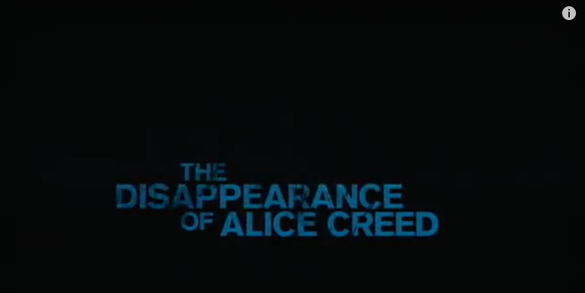
The Disappearance of Alice Creed has been a major influence of our project as a whole, however their film title is less influential.
The title feels unadventurous, and leaves the audience with a neutral feeling. This may be partly because the title itself is too long and therefore when presented is not imposing. In our own film we would like to heighten the contrast between the text and background, which we would make black.
I really like the title for 7 minutes as it contains a graphic element to it suggesting a main component with a gun. The font is slim and tall which creates a ominous effect and the use of silvery white makes it stand out from the background.
In this title, we see again the use of a all black background. I believe we should use this effect in our own trailer to increase its level of professionalism and to make it stand out more. When comparing the two titles above, '7 Minutes' is much more catchy and memorable than 'The Disappearance of Alice Creed' primarily due to its shorter length. This is a key element we must consider when naming our product as it can greatly affect the success of a film. An example of this is 'Cowboys vs Aliens' in 2011, which although it was a decent film, did not do as well as hoped, which I believe is strongly due to the bad title name.
I also really like the title for 'The Dark Knight", as it combines simplicity of font with a modern and prominent design on the screen. I also particularly like the use of the blue spotlight effect concentrated on the centre of the text. This suggests nighttime, taking a reference to the homophonic sound of Knight, and also implies the setting in a urban environment where it is most likely to see blue luminescent lights light up the streets at night.
The first costume idea for the character of the 'girl' is based upon her initial setting, at her home during the night. This would mean that she would be likely to be dressed in comfy clothes such as tracksuit bottoms. With this outfit Eliza could wear plain black shoes such as Vans, as they would blend in successfully with the outfit. This costume would reflect the young vulnerability of the girl, and would be good for the scenes inside the girls house. However when filming in locations other than the girls house, the costume may look out of place and informal.
Costume idea 2:
Grey hooded jumper
Black skinny jeans
This outfit would appear much more formal than idea 1 as wearing skinny jeans would give the audience the idea that she may have just arrived home or was planning to go out, due to them being not as comfortable. However when filming in locations that are not inside the girls house, this costume would work much more effectively as Eliza would not look out of place in her outfit.
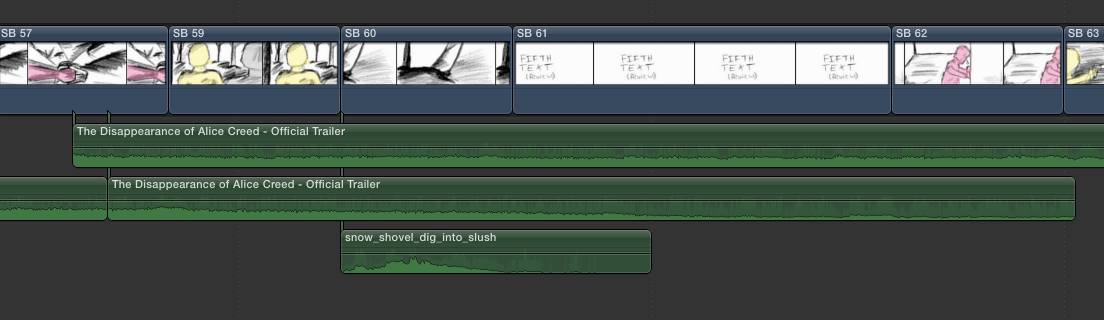
We have been using Final Cut Pro to produce our animatic. It has been extremely useful to refresh our knowledge of how the program works, as the last time we used it was last year for the AS task. By putting the animatic in to Final Cut we have been able to get a good grasp on how our overall trailer will turn out.
As you can see in the picture below we imported the still photos from our storyboards and then edited the length to fit our shot list. We then decided to add in the transitions that we had previously decided on.
We have been playing around with different features such as the Ken-Burns crop effect in order to give our animatic some motion and hopeful improve the overall quality of the animatic.
Sound was by far the most challenging aspect of this animatic, which is important to note for our actual trailer. We found it very difficult to find a soundtrack that fitted our exact needs. We wanted our animatic and trailer to contain similar music to The Disappearance of Alice Creed trailer however we couldn't find any similar music on youtube or soundcloud. This meant that we had to resort to using the music from the trailer, this isn't ideal as throughout there is dialogue from that trailer which we ideally wouldn't have. However if you simply ignore and tune out the dialogue, the soundtrack is very similar to our ideal sound.
We also plan to have several foley sounds throughout our trailer. I found a website where you can download these sounds for free, here I found many of the ones we wanted. Some however I couldn't find such as panting or an impact sound and therefore we just had to leave these off our animatic.
We found the water dripping sound on Final Cut and extended it over the start of our trailer, this hopeful gives a good introduction to our trailer before the music starts.
The zipper worked great however the heavy door slam isn't quite as effective as we would have hoped, this is due to the sound effect we found to being sharp enough as it is more of a heavy door closing rather than slamming
The shovel going in to the ground works very well, especially when combined with the picture. This is because the picture isn't very clear however once you also hear the sound effect of the shovel going in to dirt it is far clearer.
The gun shot sound was very easy to find, it sounded great however didn't quite line up perfectly with the music, which may be something we will have to address when we edit the actual trailer.