We plan to include graphics throughout our trailer however we wont be including any graphic saying the director or actors or any of there previous work as every one is unknown and this time would be better spend showcasing the reviews.
Therefore our current plan is to have:
Therefore our current plan is to have:
- 3 narrative graphics which are all shown in the first and second acts of the trailer
- 3 reviews which are all shown on in the final act
- Title
- End credits
- Release date
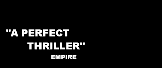
- "A perfect thriller" Empire - It's important that the audience is aware that the film is a good thriller, as there are many bad ones that come out throughout the year. Empire being a very reputable source will encourage audiences to follow it's opinion. Empire is a very mainstream magazine, however it does also include reviews of slightly lower budget films, which includes our film.
- "The smartest film of the year" IndieLondon - We also need to include a review from one indie magazine, in order to attract a wide range of different demographics. By stating that our film is smart/intelligent it may attract people who had previously never thought about seeing it.
- "Exhilarating" Times - One review should come from a well respected British newspaper and should contain a single word, this speeds up the pace of the graphics and makes the film sound exciting and something worth seeing
Currently these are the reviews which we will use however after we have created our own magazine we may wish to change the name of them. This will be very easy to do at a later date.
The plan for the graphics is to use the same font that will be used for the title in order to keep our trailer consistent. We would most likely use a black background and white text, the text will most likely also contain the smoke effect which we may also use on the title. The size of the text is also very important and the review will be larger than the magazine name as that is the least important section. The review would be in a different section of the screen each time and slowly enlarge for the three seconds its on the screen, this will be in time to the music.
A mock up for how it may look is seen below, this isn't the font that will be used however this shows a typical placement and arrangement along with how it potentially could look
AF


No comments:
Post a Comment