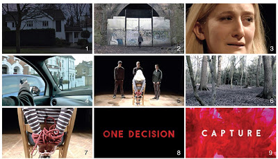
Monday, 14 March 2016

Evaluation Question 3

What have you learnt from your audience feedback?

To gain insight into our product, we recently held an audience screening. I believe the screening was very successful, primarily due to the number of people that attended. We handed out questionnaires collecting both quantitative and qualitative data which can be seen below.


Our total sample size was 17 people, of which 65% of the sample were female. This was interesting as we had initially selected our target audience being primarily male, and so have a largely female sample would give us insight our product might appeal to a female audience. Before watching the film we asked a series of broad questions about the participants interests in films. It was interesting to see that the majority of people (53%) watched at least one film per week, with a significant amount watching over 4 films. There were no participants that stated that they don't watch a film per week, thus showing that our target audience has a regular interest in films. When asked what their favourite genre was, 42% of people stated thriller and 33% comedy. This is a positive response as our product is an action/thriller in which over 60% of people stated as their favourite genre, suggesting that our product would appeal to this audience. When we asked participants what influences them to see a film, over 75% chose word of mouth. This is a particularly positive research for our product as we would aim for people to hear about it through advertising on the internet and telling their social circle. This would be our primary way of marketing as we do not have a large production budget and so would be relying on the popularity of our product to sell it. 


We found that 13/17 responses watched at least one trailer a week and everyone did not try to avoid them before seeing a film. All the participants agreed that they find watching trailers help them to decide whether they want to see a film. This beneficial for our product as a trailer would be our main way of attracting an audience to our product, which we can see may work. Furthermore it was interesting to see that 5/17 people believed that trailers can give too much away, this is good to take into account for our own product as we do not want to deter a potential audience. When asked what films they had seen out of our key influences, 14/17 people had seen The Dark Knight with a further 9/17 having seen Reservoir Dogs. These two results were expected due to their commercial success and recognizable titles. Although only a limited number of people had seen our other influences, this was not an issue as they had previously stated their interest in the action/thriller genre. With over 75% of participants stating that they watch films primarily online (whether legally or illegally),  we can conclude that our most successful distribution base would be online to reach the widest market.


After the audience had watched our trailer, we asked further evaluation questions on what they thought of our product. 14/17 responses correctly identified our trailer within the thriller genre, however only one person identified our trailer within the thriller/action genre. Even though we hoped that the results would be higher for this genre, we were aware our product had hybridity which is relatively uncommon for trailers. Thus we were aware that we would achieve less responses in this area especially as examples of hybrid films are less common. It was interesting to see that one participant identified our product within the action/thriller/romance genre. This result was unexpected, however the participant may have decoded a relationship between Mr Pink and the Girl and thus anticipated our trailer as part romance.


When we asked what participants believed the target age range of our film was, we received a broad response but the majority were within our target age bracket of 15-24. Thus informing us that we are targeting the correct age group, but also suggesting that we could target even a possibly older age range. However as we did not have any participants above the age of 18, we cannot be conclusive that our product would be successful within an older age group. Even though we had initially targeted our film at a primarily male audience, 76% of participants thought the trailer was targeting both genders with only 24% targeting male. Thus proposing that we should target both genres rather than reducing our potential market to just one.


It was reassuring to see that 65% of participants believed the correct amount of narrative was shown , with 24% thinking less should be shown, suggesting that we had shown the right level of narrative. However 11% believed that more narrative should have been shown. This was emphasized by the responses to the question asking if any sections of the trailer weren’t clear. Two people responded stating: ‘How did the girl get into the woods?’ and ‘Whats the story behind the kidnap? Why kidnap just to rescue her again?'. The first statement on the girls arrival into the woods , suggests that we may not have been clear enough in the narrative showing their arrival. Furthermore, the second statement implies an even greater problem within our narrative as we believed that the ‘story behind the kidnap’ was clear. A response misunderstanding the plot, may suggest that our narrative needs to be altered to make it clearer and thus more easily decoded by the audience. However, as we did not receive any other responses referring to this misunderstanding, then it could be taken as an extraneous variable, especially as 89% believed the right amount of even less should be shown.


The prior research was primarily quantitative, to collect qualitative data we asked participants what their favourite part of the trailer was. The responses can be seen below:

The acting, it brought the trailer together
The suspense as it was a cliff-hanger
Title at the end/Car chase with gun/Shooting Robbie as it was realistic/Eliza
The death scene
The acting it made me smile/Background music was cool
The ending I liked that it didn't give too much away
The title/The first shot of the hands tied up as it gets your attention
The pace of transition between scenes
The ending with the victim crying with a bag over the head as it was believable
When the girl was tied up good acting/Cutting between scenes
Didn’t reveal too much plot
The chase part, liked the ending because the suspense built up/The music was good too
Music was really suiting/Loved the filming from a variety of angles
The shot where 3 guys were stood around the captured girl, very dramatic
I liked the kidnap scene
Eliza crying with the bag on her face/good acting/setting
Running through woods as it was tense
Ending with the blood

It was interesting to see that many of the responses referenced the ‘pace of transition between the scenes’. This was positive to see as a key element in the production of our trailer was to ensure that the cutting between scenes varied to ensure visual variety. Furthermore, we wanted to increase the rate of transitions in the second and third act to heighten ‘tension’ and increase ‘suspense’. It was good to see that two key words which we had aimed to achieve in the production of our trailer, were mentioned positively by the audience. We decided to ignore responses referencing the quality of acting in our trailer as during production we had little influence over this and as we had no production budget we were not able to obtain professional actors. One response said the ‘music was really suiting’ which was great to hear as the music in trailers can deeply affect the audiences overall depiction and outcome of the product. Furthermore we received a positive response to the title sequence at the end which featured the effect of running blood. I also used this effect in my magazine and poster and so it can also be taken as feedback to the title in both my ancillary tasks.

To achieve a variety of responses we also asked ‘What their least favourite part of the was”:

Sitting round table, didn't seem serious
Too many scenes in house/sitting around a table
The running sequence
The scene in the house where the men discuss the girl
Started off slow/Lots of the storyline given away eg "There’s two choices" Really? We see Robbie dead…where’s the suspense?
The actors smiling when the guns where by their faces
Robbie’s acting
The scene where they are deciding what to do
The music in the background was too loud
The weird blue shot of the house
Background music slightly too loud
Some of the shots eg. House one/POV
Too much of the beginning was given away
It gave away a lot of beginning of the film


Many responses referenced parts of the acting, which as I said previously, we decided to ignore.  People suggested that there were too many scenes ‘in the house/sitting around a table’, we were aware of this however as we had a low production budget we were unable to source more varied locations. Furthermore we wanted to emphasize our film’s location in suburban London and therefore we believed that scenes within the different houses and on the street would do this. One response felt that it ‘started off slow’ and ‘lots of the storyline was given away’, however the slow beginning was crucial to exaggerate the climax and increasing speeds of the shots as the audience progresses through the trailer. Furthermore the slow beginning allows the audience to become involved with the storyline allowing it to be decoded. Additionally, it is quite essential that a large amount of the storyline is conveyed in trailers to allow the audience to have a concept of the plot. Another response described ‘the weird blue shot of the house’ as their least favourite part, this shot was in fact using day for night filming. Although the feedback suggests a dislike towards it, the effect is essential to keep continuity as our shots within the house were done at night. A helpful piece of feedback was that the ‘background music was slightly too loud’, this can be easily changed on final cut pro to allow for greater clarity between vocals and the background music.


The final question we asked on our questionnaire was ‘does the trailer make you want to watch the film?’ To which it was great to see that 100% responded ‘Yes’, especially as our participants were within our target age range and had shown a clear interest in films and our genre. Furthermore people who had prior reservations or negativities towards our trailer, showed a clear interest in the final question, suggesting our film may do well with our target audience. Overall the use of the audience screening was very useful to gain first hand feedback on our product, collecting both the positive and negative features of our trailer. However due to the limited capacity of a screening it is hard to achieve a broad non-biased view on our product, whilst furthermore attracting an audience of a wider age range. Due to this our biggest limitation was indefinitely the lack of age range in our participants as they were all 18 years old, thus in future it would be beneficial to have people of different ages or at the very least within the upper and lower boundaries of our target audience (15-24).


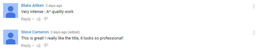
We also received audience feedback on our final upload to YouTube, this was encouraging to see as people displayed their interests in our trailer. Furthermore one comment referenced our title, which supports the feedback of both my ancillary tasks which used a similar style. It is also interesting to see that the comment included the word 'professional', thus suggesting that it looks similar to real media texts.


For the audience feedback on my ancillary tasks, I took some vox pops evaluating their successfulness and relation to real media texts. The videos can be seen below: 


The ancillary task vox pops were very helpful in understanding what a viewer notices when analysing the product. However the constructive criticisms people gave were scarce, this may have been because they were aware I was filming them and so wanted to reference the positive elements rather than the negative. However lacking in negative feedback, I felt that I was unsure whether anything needed change within my products. In future it would also be good to interview more people on my product and of different ages. This would give me a more balanced insight into the effective elements on my poster and those that need altering.

In the poster reviews, I was pleased to hear that people liked the lower third of the poster, featuring the character banner. I constantly changed the banner during the development of my poster, as I wanted to feature the three main male character but I was unable to successfully merge their respective scenic backgrounds. Thus I finally decided to create a neutral background on which I could overlay the characters. I was pleased that some people particularly liked the main central image of the tied hands, as this was a key element in exaggerating the meaning behind the title, portraying a characters circumstance. In the magazine reviews, Adam picked up on the use of colour and fonts. I was pleased with this as these features play a large subconscious role in how appealing a magazine cover can look to the viewer.

EJ

Saturday, 12 March 2016

Evaluation Question 2

How effective is the combination of your main products and the ancillary tasks?


AF
EJ
EL

Evaluation Question 1


In what ways does your media product use, develop or challenge forms and conventions of real media products?


Genre - 1

There are many conventions associated with action/thriller films, such as a clear stated original motive and the dimension between the so called ‘goodies and baddies’. We found evidence of this in films such as The Disappearance of Alice Creed; Welcome to the Punch and Reservoir Dogs. These films all contained the stereotypical conventions, which allow audiences to associate and relate to a film whether that may be through the trailer or actual product. Todorov’s narrative theory states five components in an action/adventure product. It suggests that the audience follows the characters from a state of equilibrium which turns to disruption and later returns to the original equilibrium. Through the guidance of common conventions and Todorov’s narrative theory, we tried to make sure that our film would follow in the same direction. For example this can be seen in the second act where we see the male characters questioning their perspectives and morals which leads to further disruption behind the narrative theory. This questioning is lead by our main character Mr Pink, who turns against his partners to do ‘the right thing’. This follows conventions as we see in certain films such as The Disappearance of Alice Creed, that a character who is originally portray as bad is changed for the better - their redemption. The  combination of these conventions allowed us to construct an action film trailer. 


Location - 2
The location of many action thriller films is set within areas of urban expanse. This is most clearly visible in Welcome to the Punch, as they use hyper realistic shots of London. This hyperrealism is created through enhanced blue tones which emit the feeling of a modern society. We wanted to use a large variety of locations in order to showcase diversity in the film, and keep the audience interested. Our trailer consisted of shots in a woodland area; inside of a warehouse; and interior shots within different houses. We also shot several scenes on a variety of streets, as we believed it helped to emphasise its London location. As our trailer featured a montage in act 3, the shots we captured allowed for greater scope within the rapid cuts. The use of a montage, adhered to the conventions of action/thriller films where it reflects the fast paced nature of the film. It also allowed us to showcase different elements within the film, thus suggesting what might be in store for the audience if they were to come and see it. We based our film in London, however we mainly used suburban areas such as Clapham. We believed that by basing our film in a more everyday environment, the audience would be able to relate to it in a much greater extent than a hyper realistic city scene. The suburban location also gave it anonymity, making the plot and circumstances much more believable.


To contrast our suburban scenes which primarily featured in act 1 and 2, we filmed in Sydenham Hill Woods. Inspiration of these scenes can be seen in the trailer for The Disappearance of Alice Creed. The woods are presented in Act 3 of the trailer, with the two characters holding a shovel. The composition of these two elements connote a sense of danger and suspense, which help build tension for the film. During our filming we particularly loved the depth of shots and vivacity of colour that could be captured in the woods. We decided to use the woods for our final shot in the trailer, in which our female hostage is threatened with death. As the meaning of this scene is to encourage the audience to question whether or not she will survive, we wanted the location to enhance the feeling of isolation. Sydenham Hill Woods allowed us to do this as even though it is in London, its natural uncontrolled expanse reflected that of untamed woods in the countryside.

The Disappearance of Alice Creed

The warehouse location which is reoccuringly used across the trailer was primarily influenced by Reservoir Dogs,where we see the characters spend a large amount of their time. We wanted a location such as this as due to its large spacing and intricacy of structural elements, it was able to keep the audiences attention. However unlike in Reservoir Dogs where the warehouse is captured during the day, we wanted to convey a sense of mystery and emphasise the thriller element to our film. We used a cluster of spotlights drawn to the centre of the warehouse to only draw attention to the characters, primarily the kidnapped girl. Using the location in this way, we were able to conceal the identities of the kidnappers to a greater extent and hide the expansive size of the warehouse.


Reservoir Dogs


Graphics - 8
Our narrative graphics draw upon the style and impact seen in many action films.  Our graphics were divided into two sets: reviews and narrative.  The reviews were inspired by our main film influence The Disappearance of Alice Creed, which featured rough abrasive lettering over a black background. This suggested blood or dirt, alluding to the latter conclusion of the film. An element of the reviews that we particularly liked was the variation of font size. This allowed certain words of the text to be emphasised, drawing greater attention from the audience. In our own trailer we used this idea, emphasising words such as "exhilarating" and "best British thriller", which allowed us to draw the audiences attention to words of interest. We used a strobe effect on the text which was inspired by another main film influence, 7 Minutes. This effect helped to catch the audiences attention to the content, whilst also helping to build tension when combined with the other elements in the trailer. For the reviews, we chose a plain colour scheme to juxtapose the narrative graphics. We began with a bold block font in white, to which we added effects to give the look that it was worn out and battered. This reflected the rough background of the film making it look more urban.


Disappearance of Alice Creed

Welcome to the Punch


For the narrative graphics, we were greatly inspired by those in Welcome to the Punch due to the use of a moving film behind the text. Using a clipping mask, the film featured saturated blue shapes, resembling an almost urban electronic ocean of colour. Furthermore, the blue could be connoted towards the police, reflecting the background of the film.  When planning our own narrative graphics we wanted to find a way of achieving our own moving colour. We found that coloured ink could be used in water to create a similar effect, and so we used deep red ink that flowed behind the graphics. We decided to use red as we wanted to it to suggest blood and danger. 


Title - 9

Title from the It Follows trailer

For the film title, we wanted to create something unique that would catch the audiences attention and would synergise with the conclusion of the music. We were inspired by the trailer of It Follows. The title featured a red liquid that expanded across water, this effect was captivating as it had relevance it had to the storyline, relating to death. Furthermore, the letters slowly appeared from the water, giving the effect they were almost 'oozing' out like blood.

We filmed the backdrop for the title, similarly to the narrative graphics. Our decision to use red ink in water was to insure that the written title would be lifted from the backdrop and would be eye-catching to the audience. The speed of the ink was slowed by a x4 reduction, which created a sinister horrific effect to which we paired with the sound of a slow boom. The duration of the title was set at over 7 seconds to sustain the tension brought on by the visual images. We used a sans serif font to ensure that the connotations of the title were not towards a horror film, which often use serif fonts such as in It Follows. This stand point positioned our design of the title at a cross dissolve between the thriller and action genres, suiting the market audience needs exactly. Following similar action/thriller texts, we used white for the title to increase its vibrance against the red backdrop. Furthermore, the use of white gave it an almost surgical aesthetic to it, displaying clean lines against the random twisted movements of the red water. The presentation of our title overall, greatly differs from that of conventional action/thriller texts, as they are usually white font against a black background. However we wanted to produce a title that would be able to hold its own, and one that could be transferable to our other media products including the poster and the magazine. This would create synergy between the varied mediums and increase the connection between the moving images and the still.


Narrative/Structure - 4


Our trailer follows the conventions of Todorov's narrative theory in which all narratives follow a three part structure beginning with an equilibrium, the disruption of that equilibrium, and a resolution, when the equilibrium is restored. The use of this narrative theory displays the structure in a clear and precise way, allowing the audience to relate to the plot more closely as it is shown in a familiar way. This structure has been used in the texts we have researched such as The Disappearance of Alice Creed. We also used the redemption theory as our protagonist, Mr Pink, looks to correct the mistakes he has made, thus becoming the moral compass for the narrative. Conventions such as these help the audience to follow the story even if the plot is unknown to them. When considering marketing, this is particularly important for our product due to our target of a mainstream audience. Thus meaning that it must be understood by a wide variety of people in order to be successful. Furthermore many recent films such as 7 Minutes, follow this same structure and so a current target audience would be aware of the layout.

Our trailer also follows the conventions of Barthes five narrative codes, in particular his Hermeneutic/Enigma codes offering mystery within a text. Clues are dropped within our narrative, but no clear answers are given. The use of enigmas within the narrative make the audience want to know more, and leave them frustrated if they go unanswered. When researching the structure of current media texts, we found many trailers used sound bridges and voiceovers to explain the plot through various visuals. We decided to use sound bridges in certain places as we wanted to shorten the length of the shots but we did not want cut back on the narrative. However we decided not to use a voiceover, as films that included these appeared to have one core character that conducted this. As we did not have a singular character we believed that it may instead distract the audience and confuse the hierarchy of the characters.


Colour/Style - 6
We wanted to have a great diversity of colour within our film, however we were aware this would be hard to achieve as we did not have the budget of large scale films such as Skyfall. The use of colour within a film can connect with an audience in a way that words cannot. It is a strong visual element, which can evoke different feelings depending upon the colours used. Such as red tones may be used to exaggerate anger or suspense, like in Only God Forgives, in which many scenes feature strong red hues. In contrast a colour palette of blue may be used to evoke calamity, peacefulness or beauty. This meaning is opposed in the fight sequence on a sky scrapper in Skyfall, as you would expect red tones, whilst instead blue is used. This effect is very successful as it is able to convey beauty to the violence, showing how versatile lighting can be if it is used successfully. In our own film, we were aware we would not be able to achieve the large spectrum of colours used in big budget films, however we wanted to push the tonal intensity and colour palette using primarily natural lighting.

Only God Forgives
Only God Forgives


jellyfish scene in skyfall, blue lights
Skyfall


We wanted to have a large colour variation as we believed it would give the appearance of a film on a much larger scale. For the scenes in the woods, we only used natural lighting, as we wanted to make the audience feel like the situation was real and they were there present with the characters. Using natural lighting could have been a challenge, however on the day that we chose to film, it was bright and clear allowing us to achieve our full potential in the woods. In contrast to this, we wanted to include as much chiaroscuro as we could, to create mystery and enhance the various locations. We primarily achieved this in the warehouse where we focused the lighting onto a single spot, creating an unknown expanse to the room and putting the audience in the position of the girl, in being unaware of her surroundings or captors. The style of our trailer is relatable to action/thriller audiences due to our use of low-key lighting and high levels of chiaroscuro to which the antagonists emit an ominous effect. We allow the audience to relate to the trailer from the start, as our first shows our female characters hands tied. This also sets the tone for the rest of the trailer, suggesting to the audience what may come to be. We tried to continue this sinister undertone through the graphics, by using red text with moving footage rather than the common white on black. The movement of the graphics resembles running blood, suggesting to the audience of a death that may occur.


Character/Costume - 5
Typical conventions for characters in an action/thriller genre film are very similar as we see the same construction of characters replayed across different films. Although a film may stand out more if these conventions were used, its success is predictable. Therefore, we decided to adhere to the conventions as we decided it was important to have the intentions for each character that were easily identifiable for mainstream audiences. Films in this genre often revolve around the theme of the 'good guys vs. the bad guys'. Our characters Mr Blonde and Mr White were the antagonists adhering to the category of the 'bad guys', whilst Mr Pink was the protagonist reforming to the 'good guys'. We moulded the battle between the characters on The Disappearance of Alice Creed and Reservoir Dogs as we wanted to establish the characters as all morally ambiguous from the start. This strategy then allowed the audiences initial view on the characters to be balanced, as all of the characters decided to rob the house in the second act. We established a leader through Mr White due to him being the eldest character and appearing the most controlling. This created a known threat, which allowed for the audience to make judgements on the other characters. The establishment of the leader, also allowed for comparisons to be drawn between the protagonist and the main antagonist, exaggerating their actions. The initial establishment of the leader was through his external presentation, as the actor is naturally tall and facially mature. Through camerawork we used low angle shots to emphasise his power over the group; whilst also giving him the majority of the lines to show he was in control. One common convention of action films is that one character moves from beginning as the antagonist to becoming a protagonist through the events that ensue. We decided to follow this convention due to tapestry of collisions between characters it can bring. This allowed us to create further tension by controlling the editing of the scenes between contrasting characters. To establish the status of the protagonist, we used multiple mid angle shots to suggest him as an equal to the audience. Furthermore in certain scenes we emphasised his vulnerability, such as through a singular close up and a long shot of him crouching next to the captured girl. This humanised the character, increasing the level at which the audience could relate to him, which further dehumanised the main antagonist.


Characters in Reservoir Dogs


Editing - 7
A key similarity in thriller trailers is the build up of tension created through a montage that peaks 3/4 of the way through the trailer. This build up of tension in the edit when combined with the sound, can affect the way in which the audience feels when viewing a trailer. This effect can ensue the success of a thriller trailer as it suggests it is suspenseful and entertaining. We used Final Cut Pro X to edit our trailer due to the capability and advancement of the software. For the editing, we took our main influences from The Disappearance of Alice Creed and Welcome to the Punch, this was due to the trailers ability to successfully build suspense yet convey the narrative to the viewer. Both trailers featured a slow collaboration of shots at the beginning, lasting for an average of 3-4 seconds, which increased to 0.5-1.5 seconds during the montage. This cutting of shots, connotes the action on screen as it becomes more fast paced, whilst also advertising to the audience the wide variety of shots featured in the film. By doing this, the trailer is able to advertise it product to the best degree an entice viewers into seeing it. We followed the same structure in our own trailer, featuring a build up to a montage in the third act. We found the montage challenging due to the sheer number of shots needed to convey a strong sense of action. However, after multiple re-edits, we were able to move the narrative around to create an interesting variation between the layers of the plot. 

A screenshot of our editing timeline

Sound - 3
Prior to selecting our sound, we conducted research into similar media texts. We found that multiple layers of sound had been used to create the final piece, most commonly they featured three acts of music, much like the visuals of the trailer. The layers included the use of foley sound, backing track and dialogue; which together was able to enhance the effect of the visuals. In our own trailer we used original sound created by our friend, who we briefed to ensure it would fit the trailer. After receiving the track, we made multiple edits to the sound by repeating certain beats and heightening the sound to suit it to each individual shot. This included cuts on sound corresponding with visual cuts to the trailer, which intensified the effect.  On top of this main track we also recorded our own foley sound as during editing we discovered that certain areas, such as a shovel digging up earth, needed strengthening. We also added a cinematic boom with the appearance of the title which we slowed down to create a haunting eerie effect.


Our trailer timelines


EJ

Friday, 11 March 2016

Magazine Construction

I gained inspiration into the construction of my magazine greatly from Empire and Total Film. After analysing a variety of covers, I decided that I wanted to use a single character image in the centre of the poster. This follows the conventions of many film magazines, as the use of a single subject allows for content to be easily and clearly displayed around the outside. After looking through the photos that had been taken for the construction of my poster, I thought that the image of our character Mr Pink standing on top of a roof was visually the most complex and powerful. This was primarily due to the varying features in the background of the image, making it more interesting from a distance. The image also emphasises our film's location in South London; furthermore due its skyline position, it comes across as more professional.


Once I had decided the central image, I began to test out the different ways in which I could present my magazine title. When thinking about what magazines titles mean to me and the connotation of them, I came up with three reference words: Reel, Life and Film. I particularly liked the double meaning created when the use of "Reel" is presented with "Film".  However I found that visually I particularly liked the position of text inside another, much like my inspiration, Total Film. This was due to the partition between the bold black and white colours, making the title appear less heavy overall and creating a ocular link between the words. Whilst experimenting with the titles representation on the poster, I felt that it had a more powerful effect on the viewer in the text spanned either side of the page. Furthermore this worked most effectively with block fonts such as 'Quartzo' as the graphics were immediately catchy and recognisable.


To try to diversify the variation of graphics on my magazine, I researched into different fonts on the website: http://fontsinuse.com/in/2/formats/11/magazines. I found this site very useful to achieve a broad perspective of the styles of font available and exploring the possibility of experimenting with non-stereotypical styles. I particularly focused on the Magazine section of this website as I wanted to see how real media texts contrasted different features through varied fonts. I found that the magazines that featured most varied fonts, were immediately more interesting as each exclusive felt unique. Using this website helped me to experiment with contrasting styles of fonts for my chosen magazine title, Reel Film. I particularly liked the font 'uncle typewriter', as against 'Quartzo' it connoted an edgy magazine with assorted features.


My first rough draft of the poster was minimal, featuring the title and main exclusive advertising "Capture". I was unsure where to present the main feature, as media texts position it in varied ways. However I did find that commonly the text was on the lower third of the page, enabling it to balance the weight of the magazine title. I used the font 'Champagne and Caviar' for "Capture" as I felt it conveyed the modern urban setting of our product. Initially it was hard to read any font in the lower third and so using the eraser tool and paintbrush, I faded the lower third of the poster into black. This worked effectively as when text presented on the lower third was in white, it created a strong visual contrast drawing the viewers eye immediately. To try to diversify my product, I wanted to include the reoccurring feature in our trailer of the ink. The main inclusive reason for the use of red ink is its connotation to blood and thus death. This alerts the audience to a possible outcome for our product, suggesting it as an action/thriller.  It also makes our product the most attractive piece on the magazine, drawing the audiences eyes there first.


I was pleased with my final poster shown below, which features many layers of information and graphic elelments. During the construction of my magazine, I found that adding features from real media texts, such as puffs, greatly increased the authenticity of the product. My final puff, used a contrast of black and metallic gold tones. As my magazine was predominately dark coloured, I decided to use white as the background colour of the puff to lift it off the page. Furthermore I positioned it at a tilted angle and added a shadow backdrop to emphasize its effect as an exclusive product. Due to its success in my earlier trials, I chose to present the title of 'Capture' with a clipping mask and red ink behind to create continuity, which also features in both my poster and our trailer. To try to create variation within the magazine, I used different fonts on each of the composite segments. This enhanced the visual effect that each feature is unique, emphasising the varied content in the magazine. One of my final decisions on the magazine was adding a subtitle of "our most action packed issue ever". After researching into real media texts, I found it a common feature that to make the magazine stand out from the others it would feature a statement line above the title. Due to our product having hybridity across the action and thriller genres, I was able to suggest the issue was action packed as it also referenced to our product 'Capture'.


EJ