Monday, 8 December 2014

Idents


Icon's Ident is simplistic yet interesting. it features a single photo on a black background with plain white lettering. from looking you can tell that they may be quite an stablished production company and have been in the business a while, due to the old effect of the evident.


Molly and I loved film 4's ident as it is again simplistic but is also very quirky and modern. the famous film four logo is often shown against different backgrounds. These moving backgrounds are often in slow motion or other effects which heighten the overall effect of the ident further


Paramount implies that it is the best at what it does though the use of a mountain for its main iconic background image. The positioning of the logo is also significant as it is 'on top'.  when the ident shows the movement of the 'camera' is toward sthe mountain. Molly and I could use this idea and adapt it by possibly taking our own image of a landscape.

Hammer films, a British production company, has a very memorable ident. The use of comic book images reminds me of the Marvel ident, as it also contains changing images from their infamous comics.    The fade into solid red makes the logo stand out, with the contrast of red on black. For our own ident we could use a succession of our own images within selected font.

Saturday, 6 December 2014

Music/Soundtrack ideas

From the results of our questionnaires, we could see that the two most popular for 'What type of music would you want in a psychological thriller' were ambient music that builds up and shows suspense, and contrapuntal music - which contrasts to the scene.

A example of contrapuntal music having a great effect on a scene is in the classic Reservoir Dogs ear scene. 


This music makes the incredibly gory scene even more sinister because the music is so unexpected, as it does not fit with the actions of the characters on screen, by having such a cheerful song on whilst cutting someones ear off. This disturbing choice of music also heightens the scariness of the antagonist because the viewer cannot understand why he is listening to this - makes him seem even more inhumane.

Another example of this being used to an incredibly gory, almost comedic effect is in American Psycho.


Although we think this would be an incredible way to show the insanity of the killer, we have no real scenes of gore in our opening, and therefore feel like using this type of contrapuntal music may not be relevant. Also, getting a 'classic' happy/jovial song to counter a gory scene will be impossible because of copyright laws - we will have to record our own music.

We will use Logic Pro to produce our score, needing two different types of music for our contrasting scenes. For our calm beach scene at the beginning we perhaps need no music at all other than the diegetic/perhaps expanded sound of the waves rippling on the Thames shingle. If we do decide to have music, it will be very faint and nondescript, perhaps an ambient hum or quiet chords.
Our opening mainly focuses on the club scene, and for this we will need a loud bass track to express the chaos of the space - a typical house song would be relatively easy to produce.

Wednesday, 3 December 2014

Graphics


As our film is a psychological thriller, we drew inspiration from the title of Se7en, by David Fincher, for our graphics. This title is dynamic due to its simplicity yet distorted effect. The title is a sans serif font, but then is distorted to blur the edges and it is mirrored behind it. It's as if the title is mirrored behind to relate to the meaning of the film, se7en- seven times.


We then wanted to try this type of creepy font on our own graphics. As we've be considering the title of our film to be "Blackout", we tried this on dafont.com to see how it would look. However, after trying these, we were less sure on the overall effect of them. They felt more like your typical horror/thriller title and we wanted to convey an almost scary simplicity in the title.


When exploring graphics, art of the title was very useful when looking for inspiration for our film. It collates the opening scenes of many popular films and TV series and shows them as stills. This allowed us to see a visual medium to try to work out what we would like to convey though the font. artofthetitle.com also writes about the background of the film, and has the productions studios reasons to the style and choice of their opening title sequence. 


From the first time i watched american horror story, i was immediately impressed by the iconic opening sequence. This sequence is replayed at the beginning of every episode and so need to be memorable and convey the horror shown in the series 


Even though we do not need to make opening credits, i found the site very useful in terms of inspiration for graphics for our title and the way we might portray it 

From looking at multiple film graphics, we realised that we wanted to use a font that looked modern and edgy, yet if shown in the right context, (at the end of our thriller opening scene), would look terrifying. These were some of the titles we liked the most:  
Basic Title 
Mesmerize

We really liked the font "Neou"as it made the letters spaced out and bold. 
We were also thinking about what we would like our title to be, and came up with "Strobe". we felt this reflected the party scene proposed in our opening and as a flash turns on and off rapidly, shows how quickly things can change. We tried the font "neou" on both of our possible titles:
Neou
However we didn't like the "R" on Strobe and so if we choose this title, we are unlikely to use the font 'Neou'.
Neou


Monday, 1 December 2014

Location

We were looking for a location that would be able to show off an edginess and eerie like persona in London. As our first scene is set with the main character sitting on a beach, immediately our initial research was to find a location such as this. We want to be able to have the character still in London, but give the feeling that she is in isolation. 
I found a few locations along the thames where the appearance looked suitable. The three best locations, were Blackfriars Bridge; the embankment beach and a small area of beach outside the Oxo tower. 
all three of these locations offer the suitable beach we are looking for and some form of overhead cover, such as a bridge, to resonate that the location is in a highly populated area.


Here are the three areas on a map, showing their proximity to eachother. This will make it easier for us when doing a recce.


Characters, Costume, Props

These are 'mood boards' showing what we feel the characters in our opening scene would be wearing.


Our key character is the main protagonist (woman in her late teens/early twenties) - as our opening revolves mostly around the kidnapping, the party in the club and if we choose narrative overview B - the morning after.

We want to dress most of the people in our makeshift club in similar attire, stereotypically dressed to explain to the reader the situation and perhaps make it relateable to younger audiences. 


This mood board was relatively easy to create, because we experience this kind of dress first hand at parties we attend. Collating our ideas of what the average late teen would wear on a night out - this is what we came up with. A key concept is glitter, a trend that has been popular since summer, this can be portrayed in both makeup (top left) or in clothing (the bottom left skirt). Crop tops are an obvious choice for showing a girl of this age - whether they are low cut, plain or incorporating mesh which is a popular choice among people of this age. We have incorporated this type of clothing with many of the 'classic' accessories like Nike drawstring bags, Nike air max, large hoop earrings and fake nails. Many girls our age have belly button piercings, which is not compulsory but may suggest a more urban vibe to our opening. Again, if our main character smokes we will create a more gritty image by accessorizing her with less classy - see below - cigarettes.


If we choose to have a 'business woman' i.e. narrative overview A - this is what we picture her
wearing.


We wanted her to seem sophisticated and classy, styling her in a classic blazer and midi length skirt, coupled with an expensive tote bag (if we can get our hands on one!) Depending on the weather perhaps a burberry-esque mac, and if the weather is bright some statement cat eye sunglasses.
We want to give her the appearance of wealth, with impeccably manicured nails, a state of the art phone and if we decide she is a smoker - the most expensive cigarettes possible that exude wealth: i.e Malboros or black/coloured sobranies.


Shown in the late teen/party moodboard at the top of this post is a simple necklace with an initial pendant on it, if possible to obtain one of these - we would like both older and younger versions of our main character to be wearing this. This choice would in turn make it easier for the audience to realise they were the same person.


This what we would like the majority of our 'clubbing' males to be wearing, clothes that suggest an urban, London theme. We have chosen major brands for the clothing e.g. Carhartt, Palace, the North Face and common shoes choices like New Balance and Nike air force which we feel represent our age group the best. In terms of accessories, we have picked bucket hats and chains - which not everyone has to wear but we feel would give a more edgy urban vibe to the film.


Style and Tone

Because our film is mainly set on the streets of London at night, we felt noir would be the best style of film to try and emulate. An inspiration for us is the film 'The third man', which employs lots of chiaroscuro (high contrast, lots of shadows) throughout the film. Although the film has no colour, many stills refer directly to how we imagined our opening to look, especially the picture below.

This still is almost identical to how we wanted our final shot to look, a backlit, silhouetted male/female walking into an alleyway. Even the reflection of the pavement from recent rainfall is something we wanted to take advantage of because of the incredible effect it gave. This particular film is set in Allied-occupied Vienna, which means the set shown in the picture above is quite decrepit but still urban - shown through the buildings and roads.
We want to modernise the noir genre for our opening, replacing the old fashioned dress of 1930s-50s with urban street-wear shown in our 'costume ideas' post. Immediately this style will be modernised through the use of colour, we want to use vivid, saturated hues to show the vibrancy of life in London at night.


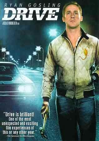
A film that has already modernised the noir style is Drive, by Nicolas Winding Refn in 2011.

Although this is a theatrical poster and not a film still, I thought it emulated well what we are trying to achieve in our opening. The use of bright lights from street lamps and car headlight in an otherwise black city is a different way of attempting chiaroscuro - using the contrasts in light and dark to convey modernity as well as an eerie feel.

The colour palette used in Drive is also useful for us because most Noir films are in black and white. In the film vibrant hues are used - especially blues, which is what we are trying to convey.

The title sequence of Drive almost exactly shows the urban theme we want to convey, with the crane shots of the city and empty shots of the roads from P.O.V as Ryan Gosling drives his car.

https://www.youtube.com/watch?v=LDCt1V8T3To
(embedding has been disabled)

Although this as an opening sequence shows Ryan Gosling as isolated in his car in the dead of night in an empty city, and we want to show the chaotic nature of a night out in London - we feel like the colours and style of this film is something we really want to try to produce.

Narrative

NARRATIVE OVERVIEW - for the day after

Here is our second option for our film opening, the present day scenes are shown in white, and the past is shown in blue.
o  A soundbridge of rippling water coupled with a black screen fades into the opening – a young woman in her early 20s/late teens, looks out across the Thames water, relaxing.
o  She is visibly beaten up/makeup run down her face, mangled hair.
o  There are shots of the water, slowly intercut with views of her surrounding – Hungerford bridge/tower bridge.
o  Maybe she has a cigarette – an cheap type, perhaps pall mall, and looks around – breathing deeply.
o  Flashback to the night before - maybe '2AM' is shown in the bottom right hand corner. 
o  This is a New Years event at a club
o  The place is packed full of people dancing, the camera passes through the bodies intermingling on a tracking shot.
o  Heavy dance music is being played, people are sweating- a sense of claustrophobia that contrasts to the calm scene by the thames.
o  The camera turns at some point during the chaos and reveals the woman from before on a night out. The viewer knows this is the same person because of a necklace with a pendant of either their name, or their first initial.
o  His face is unclear, but a tall (slightly awkward feeling) man is obviously trying to dance with her. He kisses her neck and touches her body as she slightly recoils.
o  The scene of the two is often interrupted by people pushing past, again accentuating the feeling of chaos.
o  Shouting is heard from another part of the room, the camera turns and reveals her friend explaining that they are leaving.
o  The main character leaves the ominous male standing by himself as she leaves to catch up with her friends.
o  She bustles with her friends out of the club with a cigarette to her lips.
o  Closeups of the friends as the move along the pavement away from the building, laughter and joviality is portrayed through the amicable nature of the scene, perhaps they have their arms on each others shoulders.
o  Sense of blurriness as cars pass, creating lines of colour – experiment with shutter speed to get this effect?
o  Main character’s phone rings
o  Goes off into a sidestreet trying to hear whatever the person is saying better.
o  Wide shot from back of alleyway of  girl entering to hear the person on the other end of the phone
o  Final shot of a dark figure entering the alleyway, the viewer is unable to see who he or she is.


Narrative - for business woman

Here is one of our options for our film opening, the present day scenes are shown in black, and the past is shown in blue.

o  A soundbridge of rippling water coupled with a black screen fades into the opening – a woman in her 30s sits on the shingle, looking out across the Thames water, relaxing.
o  She is perhaps eating her lunch, a salad.
o  There are shots of the water, slowly intercut with views of her surrounding – Hungerford bridge/tower bridge.
o  Maybe she has a cigarette – an expensive type, perhaps malboro, and looks around – breathing deeply.
o  Flashback to 10 years ago. 
o  This is a New Years event at a club
o  The place is packed full of people dancing, the camera passes through the bodies intermingling on a tracking shot.
o  Heavy dance music is being played, people are sweating- a sense of claustrophobia that contrasts to the calm scene by the thames.
o  The camera turns at some point during the chaos and reveals the businesswoman from before as a woman in her early 20s on a night out. The viewer knows this is the same person because of a necklace with a pendant of either their name, or their first initial.
o  His face is unclear, but a tall (slightly awkward feeling) man is obviously trying to dance with her. He kisses her neck and touches her body as she slightly recoils.
o  The scene of the two is often interrupted by people pushing past, again accentuating the feeling of chaos.
o  Shouting is heard from another part of the room, the camera turns and reveals her friend explaining that they are leaving.
o  The main character leaves the ominous male standing by himself as she leaves to catch up with her friends.
o  The slam of the door as the group leaves brings the present day business woman back to reality.
o  She gets up from the shingle and walks along a bridge (whether it’s Hungerford, Tower bridge or the millennium is irrelevant)
o  Perhaps lifts a cigarette to her lips, which is intercut quickly with a scene of past-main character, adjoining the two.
o  Younger past woman bustles with her friends out of the club with a cigarette to her lips.
o  Closeups of the friends as the move along the pavement away from the building.
o  Sense of blurriness as cars pass, creating lines of colour – experiment with shutter speed to get this effect?
o  Main character’s phone rings
o  Goes off into a sidestreet trying to hear whatever the person is saying better.
o  As past clubber-girl walks into the alley, it flips back into present tense, the business woman is walking along the same street and happens to walk past exact same alleyway
o  Pull focus wide shot from back of alleyway shows her tentatively looking inside, as if the place pains her.
o  Same wide shot from back of alleyway of younger girl entering to hear the person on the other end of the phone
o  Final shot of a dark figure entering the alleyway, unable to see who he or she is.